Wednesday, 16 December 2015
Wednesday, 2 December 2015
Sunday, 29 November 2015
Analysis of my magazine front cover
Masthead
I chose the title 'KHS Break' as my masthead because I feel
like it is a suitable masthead for a school magazine as it
represents the events in a school day. 'KHS Break' gives
the impression that when you are reading the magazine you
are finding out about events happening in your school. The
masthead is in yellow and black as they represent king henry's
two main school colours. The size of the magazines masthead
in my opinion is a good size as it is bold, clear and stands out
well.
Main Image
For my main image I chose to take a medium shot of a female sixth form student, the image shows
her smiling which gives the impression that school life is joyful. The masthead is the
 largest image on the magazine as it is the main image and it helps give the impression that the magazine has been produced for students. I positioned the main image in the Centre of the
magazine as it stands out and leaves plenty of room around it to fill with sell lines, pugs etc.
Sell lines
I placed five sell lines on the front cover, these sell lines
reveal the contents the reader may find inside the magazine.
I placed the sell lines against a light shade of grey background,
this helps the sell lines stand out and appear clear to read.
The sell lines are yellow with a black outline, this is to make
the cover look more interesting and the sell lines appear bold
and easily noticeable. Each sell line represents the events
happening within the school.

 areas of the cover.

happening within the school.
Subsidiary images

I chose to include three subsidiary images
on the front cover of the school magazine.
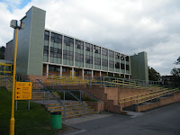
I decided to include images of the school
to show where the magazine is based.
I made sure that the subsidiary images
were smaller than the main image. I
feel like I have placed the images
in appropriate areas of the magazine
cover as they stand out and they are
not covering any sell lines or important
 areas of the cover.
Pug
The pug has been placed above some sell lines and above the main image.
The sell lines indicate what could be found inside the magazine.
I think the colours used stand out as they are bright and noticeable.
The yellow is used as it represents one of the school colours.
Header/Footer bar
The header bar is black with yellow writing, this is to show the schools
main colours. The header bar gives an idea of what you can read about inside,
the header is bold and is placed at the very top of the cover.
The footer bar is placed at the bottom on the cover, it is also black
and yellow and contains another clue of what you will find inside.
Subscribe to:
Comments (Atom)
